Nick Kapica on Wayfinding, Urban Experience and Human-Centred Design
Article by Design Assembly
Ahead of Sign & Print Expo 2026 on 17 June, Design Assembly sat down with Nick Kapica to chat about wayfinding, typography, public spaces, and the subtle design decisions that help people feel confident, comfortable, and connected to the places around them.
Your work sits between architecture, urban design, wayfinding, and fabrication. How would you describe the role of experiential graphic design in shaping how people move through and experience a space?
I see the role of experiential graphic design as amplifying what’s already there rather than imposing something new. Every space I work with already has layers of intentional intervention—architecture, urban design, landscape architecture—each informed by research, problem-solving, and ideation. My work isn’t additive in isolation; it builds on this foundation.
What I do is extract and enhance the ideas already embedded in a space, then translate them into legible cues for people moving through it. Sometimes that’s a beacon that creates orientation; sometimes it’s contextual information that enriches understanding. The goal is to help people extract more meaning and clarity from the place they’re in.
Of course, context shapes everything. An airport demands different strategies than a theater or a park—each has its own logic, rhythm, and relationship to the visitor. That specificity is where the work becomes interesting.
In your upcoming talk at Sign & Print Expo 2026, you mention “connecting the dots” between bold visions and human-centred environments. What does that process look like in practice?
People move through public space in fundamentally different ways. Some know exactly where they’re going. Others are searching for something specific. Some are deliberately wandering, even in familiar places. Experiential graphic design has to hold all of these simultaneously—any intervention I add needs to “read the room” and understand what people need.
That’s why I frame myself as an experiential graphic urbanist. It gives me permission to sit at the intersection of two conversations: the bold, large-scale visions established at masterplan level, and the granular, human-centered needs that actually determine whether a space works. Accessibility, legibility, readability—these aren’t afterthoughts or constraints. They’re how vision becomes inhabitable.
The work is translation. I take the conceptual ambitions of a masterplan and ask: How does this feel to move through? What does someone actually need to understand this place? That’s where experiential graphic urbanism connects the dots—between the architect’s vision and the visitor’s experience.
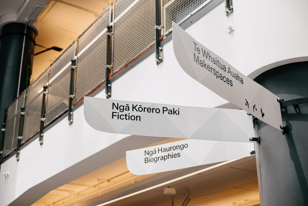
What are some of the most overlooked elements when designing for readability, accessibility, and intuitive user experience within public spaces?
A sign works best when it’s in the right place at the right time—which is far harder than it sounds. Path and node diagrams help us map decision points, but they’re a starting framework, not a prescription. Just because there’s a node doesn’t mean there needs to be a sign there.
What actually matters is occupying that node yourself. Standing where a visitor would stand, understanding what’s visible in their field of view—that determines whether intervention is needed at all. Sometimes the architecture speaks clearly enough. Sometimes the architecture is the problem. I often remind architects: we might be calling this a wayfinding issue, but it’s actually an architecture problem. The best solution is a building that minimizes wayfinding needs entirely, or makes them irrelevant.
Once a location is confirmed and we’re placing information, accessibility becomes critical. New Zealand’s building codes are relatively permissive compared to other countries, but there’s solid evidence—quantifiable, research-backed—about what people with low vision, dyslexia, and ADHD can actually process. It’s our job as designers to advocate for that.
And yet, the simplest things get overlooked repeatedly: line length and type size. I’m still surprised how often these basics are mishandled, even though they’re foundational to readability.
Wayfinding is often something people only notice when it fails. What makes great wayfinding design feel seamless and natural?
You can never help everyone all the time, but you can help most people most of the time. That’s the starting point.
Early in a project, user research establishes a destination hierarchy—what actually matters to the majority of users. That’s where the focus goes. If departure gates are critical, they must work flawlessly. The next tier of information follows, then the next, until you reach a threshold where adding more stops working entirely. It becomes cognitive overload.
The subtle art is knowing when to stop. It’s about saying no—being rigorous enough to exclude information that seems important but isn’t actually serving the user. But wayfinding doesn’t exist in isolation. The graphic system is just one layer in a much larger sensory ecosystem. You might hear the café before you see the sign for it. You might smell food, or catch the ambient sound of a busy concourse. These cues are working alongside the wayfinding, reinforcing it, sometimes doing the heavy lifting themselves. A well-designed space lets all of these elements work together—the signage steps back because the architecture, the acoustics, the sensory landscape are already orienting you.
Restraint is what makes wayfinding feel seamless. The moment it feels like too much, it stops being helpful and becomes noise.
How do you balance visual identity and brand expression with the practical function of helping people navigate spaces confidently and comfortably?
The job of wayfinding is to guide and strengthen the experience—which ultimately adds to the brand. But that’s different from wayfinding’s job being to display brand identity.
Brand is bigger than the building kit. It’s the idea, the promise of the place itself. When I’m moving through a space, I need to experience that promise, not see it represented. I don’t need the visual identity reinforced at every touchpoint. Some cohesion helps—a considered link—but I think less overt branding through visual identity in wayfinding, and more emphasis on how the space behaves as a reflection of the bigger brand idea, actually creates a stronger overall brand experience. Nomenclature, tone, and feel do much more heavy lifting than visual elements borrowed from the brand identity.
This is where I expect the conversation will go with Emme Jacob from There at Sign & Print Expo 2026: How do you build brand through experience rather than visual repetition? How do you let a space speak for itself? It’s a fundamental tension in environmental design—and it’s where wayfinding and brand strategy actually need to be in conversation from the beginning, not bolted together at the end.
Are there any projects you’ve worked on that particularly shifted the way you think about urban experience and human-centred design?
Every project shifts my thinking about human-centered design—that’s the nature of the work. But honestly, getting older has been equally instructive. I wish I could say that empathy alone was enough, but it’s not. I’ve always thought about accessibility, but I wasn’t truly concerned about it until I experienced reduced vision myself.
I think design education should prioritize this over the usual creativity exercises. Every design student should spend a day navigating the world through various vision impairments—simulated low vision, color blindness, tunnel vision—just to understand the stakes when they’re twenty. Sit in a wheelchair. Move through a space the way someone with mobility challenges has to. These aren’t theoretical exercises. They’re the difference between designing for people and designing with understanding.
This kind of embodied learning should be foundational, not optional. Once you’ve experienced a space from that perspective, you can’t unsee the problems. And you won’t accept mediocre solutions anymore.
Technology continues to influence how people interact with environments. How do you see digital experiences changing the future of wayfinding and experiential design?
I’m old enough to remember when people said print was dead—that the internet would make everything digital. Well, that didn’t happen. Print didn’t die. If anything, the sheer volume of books being published—especially with self-publishing and print-on-demand—has exploded far beyond what existed when the internet went public.
I think wayfinding and experiential graphic design are becoming more relevant, not less, as people seek real experiences away from devices. Yes, a maps app can plot the fastest route from A to B. Your watch can tap your wrist to give you direction change hints as you walk through the city. But you also have a choice: navigate by looking around, reading visual cues, following signs, consulting a city wayfinding map. It’s more engaging. It feels human again.
There’s a place for both. Sometimes, when time is critical, I let the device take over. But I just spent two weeks in London—a city I know reasonably well—and I found myself deliberately leaning into the Legible London system instead. In moments of uncertainty, there’s something pleasing and satisfying about reading a physical map, about choosing your own route. The device gives you efficiency. The environment gives you agency.
That’s the future I’m interested in—physical wayfinding offering a genuine experience in a world saturated with screens.
What role does materiality, signage production, and fabrication play in bringing these environments to life successfully?
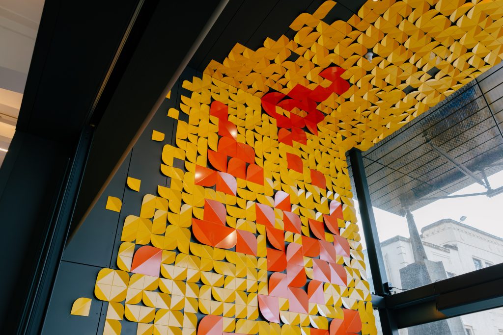
Materiality is the most important thing. It’s what a digital screen—in our hand or on a wall—can’t offer. It’s what transforms the pragmatic requirement of information in the environment into something experiential.
Material choices tell a narrative. They build on the architectural palette we discussed earlier. They create texture, weight, presence—things that exist in the world, not behind glass. That’s where the real work happens.
And you can’t do this alone. You need great fabricators—people who understand how materials behave, how things can be beautifully built. They’re drawing on everything from traditional sign-writing techniques to contemporary digital fabrication. The expertise matters. An idea stays an idea until a skilled maker translates it into reality, and that translation—understanding the grain of wood, the finish of metal, the way light catches a surface—is what brings these spaces to life.
For designers interested in moving into experiential graphic design or wayfinding, what skills or ways of thinking do you think are most valuable?
You need three foundational strengths: great typography, strong spatial understanding, and the ability to design with materials in three dimensions. But the real skill is drawing from across multiple design fields.
Study the key bits of visual communication—how information hierarchy works, how to communicate clearly. Study industrial design—how objects function, how materials behave, tolerances, production constraints. Study spatial design—how people move through environments, how scale and proportion affect experience. It’s not about becoming an expert in each. It’s about understanding how they intersect.
A wayfinding system with beautiful typography but no spatial awareness will fail. One with great spatial thinking but poor typography will confuse people. One designed without material understanding will look cheap or fall apart.
Assuming you are a Visual Communication Designer working in teams clarifies your role—the architects and urban designers you’ll work with are spatially sharp—they understand form, scale, how spaces work. Where they often trip up is typography, visual rhetoric, semiotics. That’s where you bring value. Understanding those fields gives you a language to speak with architects on equal footing, and it clarifies your role: you’re not decorating their work, you’re translating spatial ideas into legible communication.
The most valuable skill might be this: Learn to see holistically. Don’t design a sign. Design how a sign sits in a space, how people encounter it, what it’s made of, what it communicates. That integration—visual, spatial, material, functional—is what separates good wayfinding from great wayfinding.
Most wayfinding designers emerge from one starting field—Visual Communication, Industrial Design, or Spatial Design—with a foundational strength. Your job is adding the other bits. As you reach into adjacent design fields, you pull out the parts most required for wayfinding.
What are you most looking forward to sharing with attendees at the 2026 Sign & Print Expo?
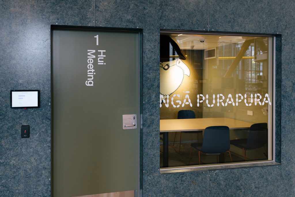
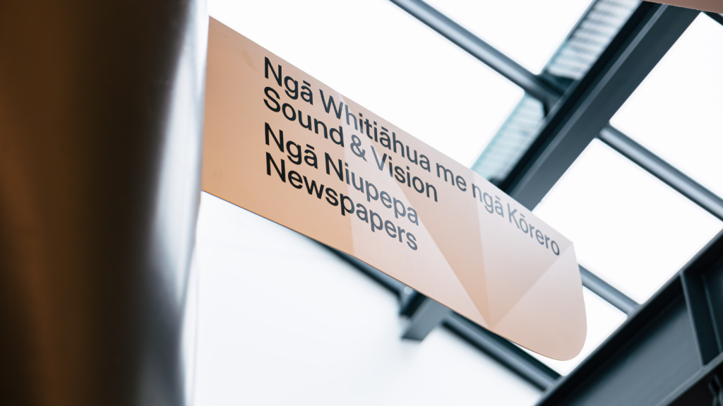
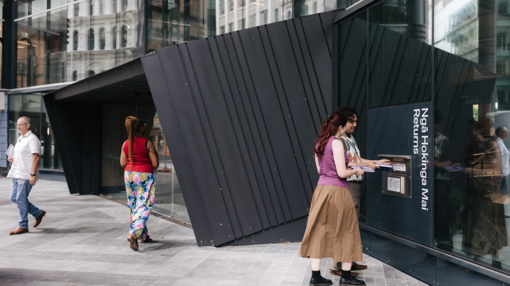
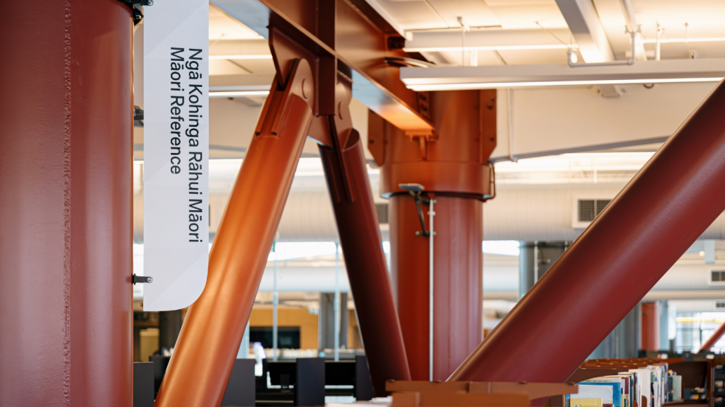
All of this—but particularly the challenge of bilingual wayfinding and what that means in the context of Aotearoa New Zealand.
It’s a conversation that goes beyond design technique. It’s about language, identity, and how we honor the stories embedded in a place. Bilingual wayfinding isn’t just about fitting two languages into the same space—it’s about deciding which language leads, how they coexist, what visual weight each carries. Those are cultural and political decisions, not just design ones.
In Aotearoa, we’re at an interesting moment. Te Reo Māori is resurgent. More and more public spaces are embracing bilingual signage. But the how—the design, the hierarchy, the material expression—still matters enormously. Get it right, and you strengthen both languages and the relationship between them. Get it wrong, and you inadvertently reinforce the very hierarchies you’re trying to challenge.
That’s what I’m looking forward to exploring with attendees: how wayfinding becomes an act of cultural respect, not just information design. How the choices we make as designers ripple outward in ways we don’t always see.
Come along to the Sign & Print Expo on 17 June at Auckland Showgrounds to hear Nick sharing his insights on wayfinding design live on stage. Entry is free!
Register to attend Expo
Register for the Wayfinding Speaker Session